Expert Review
Prosoon - 2/3
Tourism, Service
Usability Evaluation, Expert Review, Audit & Recommendations
February 2026
Due to its scope, this project is split into three case studies. This academic +140-page group project received high marks (18/20 and 20/20).
Overview
This is the second case study about Prosoon.
Read the first one: Case Study 1/3 – Competitor Analysis
Prosoon‘s company provides digital verifiable credentials and badges to showcase and attest the success of the users academic studies and professional training. It also offers a job board as a main feature.
Prosoon facilitates connections between three key audiences:
Institutions: Uploading authentic digital badges and degrees.
Employers: Publishing job offers.
Students & Job Seekers: Showcasing their skills, ensuring they are verifiable and support their job search.
Our goal was both to understand the needs of students and Job seekers and to evaluate the usability of the interface.
For this academic project within a team of five, I was one of the two main contributors.
My missions were as follows: running a competitor analysis and an expert review, writing and running the usability test, moderating an interview, recruiting participants, analyzing and creating the visuals for the data and contributing to writing the report.
Goals
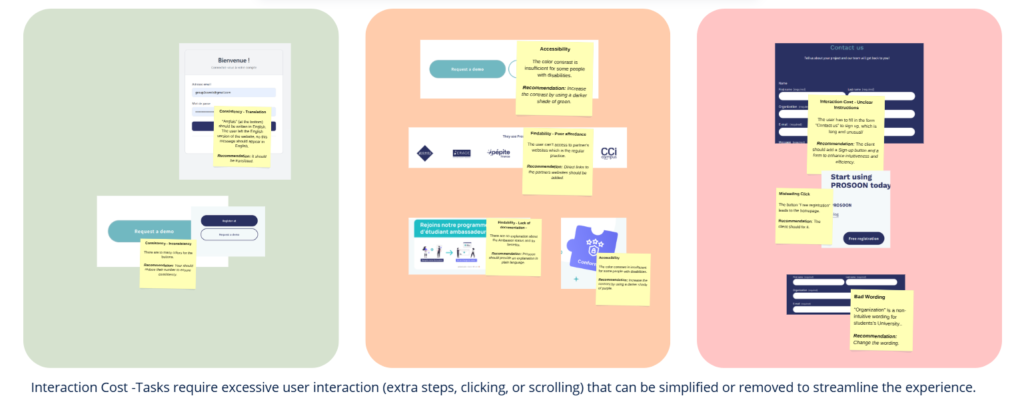
A part of my work consisted of conducting an Expert review to inspect Prosoon’s platform and website, identify usability issues, and classify them into a strategic roadmap. At the same time, another student Katie Vieyra carried out a heuristic evaluation.
The data collected through these complementary approaches aimed to assess the usability of the interface and provide detailed recommendations regarding the modifications that should be implemented, while also highlighting which issues were the most urgent. This phase was critical to transforming raw observations into a strategic roadmap for Prosoon.
Approach
To ensure an objective and rigorous diagnosis, I based this audit on Andrew Kucheriavy’s 15 Usability Impediments.
Each identified friction point was categorized into three core types of user impact:
Extra Time Effort: Friction slowing down the user’s journey.
Unexpected Experience: Moments of confusion or broken mental models.
Evolving Limitation: Structural issues hindering long-term engagement.
In addition to these, I integrated specific audits for Translation and Microcopy (Wording) to ensure professional credibility.
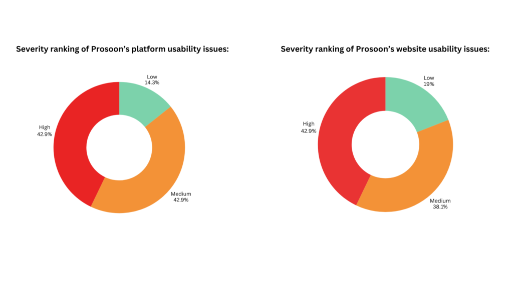
The Framework: Severity & Prioritization To help Prosoon’s team focus on high-impact fixes, every issue was ranked by severity:
🟢 Low: Minor friction, cosmetic improvements.
🟠 Medium: Notable obstacles that degrade the experience.
🔴 High: Critical blockers impacting conversion or retention.
This helped the client quickly identify and address the most urgent issues. I also created visual graphs to provide a quick overview of the severity rankings across both the platform and the website.
Insights
However, the website and platform have solid foundations:
Platform: Clear dashboard menu with effective hover states.
Website: Simple layout that reduces cognitive overload and builds trust through plain language regarding blockchain.
I identified several structural weaknesses such as:
- Dead ends
- Poor affordance
- Confusing information architecture
- Missing confirmation messages
Solutions & Outcomes
My audit provided Prosoon with a prioritized roadmap, helping addressing the client actionable improvements.
Here are three key recommendations among many:
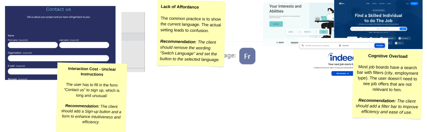
🟠 Search & Filtering: To align with industry standards (Indeed, LinkedIn), I recommended adding a search bar with filters. This allows seekers to refine results quickly and avoid cognitive overload.
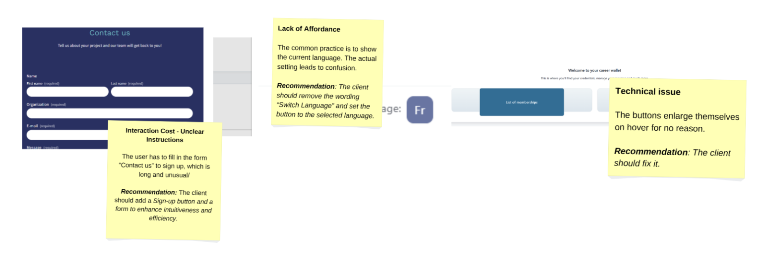
🔴 Language Navigation: The « Switch Language » wording was causing confusion. I recommended displaying the currently selected language directly on the button to improve clarity and system status visibility.
🔴 Sign-Up Flow: Using a « Contact Us » form for registration was a major friction point. I recommended a dedicated « Sign Up » button and form to separate inquiries from onboarding, significantly improving intuitiveness.
Accessibility & Compliance
Beyond functional fixes, I identified several accessibility gaps. I provided specific guidelines on color contrast to ensure both the website and platform meet universal design standards.
What I would improve
Looking back, I would now aim to provide even more precise recommendations to the client.
For example, when addressing color contrast issues, I sometimes suggested solutions such as “choose a darker green.” Today, I would propose more specific options, such as presenting three concrete color alternatives that improve accessibility.
I would also ensure that suggested wording improvements are even more precise.
Although this was already partially addressed, I have since learned to go further. This experience helped me understand how I could work with even greater accuracy in future UX analyses.
This case study is part of a comprehensive 140-page strategic audit. You can access the full report at any time via the link below, or continue reading the third Case Study: UX Research & Usability Testing.
Tools: Miro (research and mapping), Zoom (video recording), Canva (Visual Assets)