My Articles & Reflections
Blog
What tailoring taught me about UX design
June 2026
I thought switching from tailoring to UX was a career change. The more I learn, the less convinced I am. Tailoring was already teaching me many of the things I enjoy most about design.
When people think about tailoring, they often think about sewing. But a garment starts with a person. Their body, of course, but also their habits, their movements, their constraints, their tastes, their budget, the occasion they are preparing for and sometimes their insecurities.
The challenge was never simply to make a beautiful garment. It was to design something that worked for a specific person in a specific context.
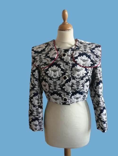
There were conversations, sketches, research, fabric sourcing, pattern drafting, fittings and adjustments. Some projects sent me through stacks of vintage fashion magazines from the 20s to the 90s, and occasionally deep into books on historical costume. Others led me through warehouses full of fabrics in search of the right material.
Every decision created new possibilities and new constraints.
Pattern drafting: between creativity and problem solving
Pattern drafting was probably my favourite part. It sat somewhere between creativity and problem solving: translating an idea into a structure that could actually work once confronted with a real body, real movement and real constraints. Looking back, the parallels with UX are hard to ignore. The pattern is the architecture – the decisions about how pieces relate to each other, what goes where and why. The toile is the wireframe – a rough, low-fidelity version in cheap fabric, built to test the structure before committing to the real material. And the finished garment is the high-fidelity prototype: the version you put in front of someone and watch them actually use.
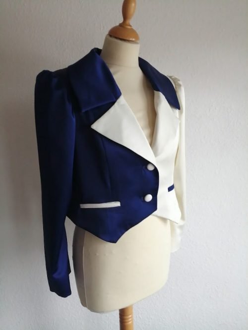
The fitting: where everything is revealed
The fitting was often the most revealing moment.
People don’t always explain what feels wrong. You learn to observe. To notice hesitation, discomfort, repeated gestures and the gap between what someone says and what they actually experience.
A client might say « it’s fine » while pulling at the fabric, shifting their weight, avoiding a particular movement. That gap between the stated and the lived is where the real work begins.
Years later, while conducting user interviews and usability tests, I often catch myself looking for the same things. Not just what people say, but what their behaviour reveals.
What actually transferred
What I loved about tailoring was never limited to clothing. It was the process of understanding people, designing within constraints and refining a solution until it truly fit.
The tools are different. Figma replaced the sewing machine. Miro replaced the cutting table. But the questions feel remarkably familiar:
- What does this person actually need, not just what they say they want?
- What constraints are shaping their experience?
- How do you keep refining until it genuinely fits?
That’s probably why UX felt so familiar from the start.
How can museum applications and websites offer user-centered experiences?
May 2026
This article was originally published on the CAWEB Master’s blog.
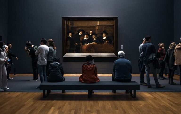
All over the world, the COVID crisis has challenged cultural institutions by prompting them to rethink museum experiences and imagine digital mediation differently. Those very particular circumstances allowed them to provide content to people deprived of their freedom, but enjoying a precious asset: time. Even though the world faced emergencies, those months showcased the urge and need for cultural content. How did museums deliver innovative approaches to digital mediation through their websites and applications? Which types of user-centered experiences have emerged over the past decade? How did the teams think beyond the regular process? We will attempt to answer these questions by focusing on one of the leading figures: the Rijksmuseum in Amsterdam.
For years, museum websites mainly focused on displaying collections online, but today there is more audacity in the cultural market. It requires making an effort to diversify its product offer in order to broaden the target audience.
Design Thinking at the Rijksmuseum
Thus, in 2012, the Rijksmuseum had already pioneered a new feature entitled Augmented Masterpieces. On the app, users added their own content to enrich visitors’ onsite experience by sharing their own stories tied to artworks.
It was created by Johanna Barnbeck, Dr Jan Hein Hoogstad and Shailoh Philipps through the Design Thinking process. The creators aimed to decrease the fear and feeling of illegitimacy that some people experience towards artworks. This concern is also shared by people who feel ashamed for not being tech-savvy. They compare themselves to an imagined “ideal user” perceived as younger or more experienced, although websites and apps should be tailor-made for everyone.
To ensure that the new digital cultural mediation was relevant for a broad audience, the team met and observed visitors and decided to value “empirical methods more than surveys and questionnaires”. The idea was to fully involve users and the entire museum team from the very beginning of the process. Shailoh Philipps explained: “Museum culture is full of assumptions about who visits and how they want to engage with artworks in the museum. It’s interesting to see how design thinking can build a bridge between visitors and museum staff. […]”
So, there are different methods to use Design Thinking, but the basic steps remain almost the same:
- Empathize: Leave assumptions at the door and get to truly know the users, their needs, their behaviors, and their expectations by meeting them, running workshops or interviews, among others.
- Define: Gather all those insights, extract key findings, try to identify patterns, highlight pain points, and define your scope. Use some tools: create personas, draw empathy maps and journey maps, in order to be accurate and relevant.
- Iterate: Don’t be afraid of modifications: they are the key to building a project true to the users’ needs.
- Prototype: Focus on the ideas from the previous steps, it’s time to turn them into concrete outcomes.
- Test: Test your prototype with surveys and usability tests, then iterate.
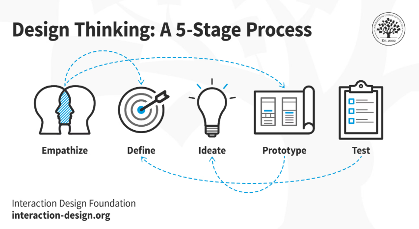
It’s important to notice that iteration is required throughout the process.
Collection Online : three user-centered paths
Since 2024, the Rijksmuseum has been offering a new AI-based experience called “Collection Online”. More than 800,000 artworks (high-resolution images) are displayed to satisfy users’ curiosity. It delivers an interactive user-centered journey split into different paths:
Tell your story: Users can select and virtually hang their favorite artworks in a 3D version of the famous Gallery of Honour. It allows them to put themselves in a curator’s shoes for a few minutes. The galleries can be visited virtually, so everyone is invited to create their own exhibition. As the best ones are featured on the dedicated platform, this tool enables visitors to discover multiple perspectives.
Following the Art Explorer path, users can also play an active role by answering a single question about themselves. Some questions are tied to art, such as “Which theme do you enjoy the most in art?”, while others focus on different topics: “What taste brings you back to a special memory?” or “What is a simple activity that makes your heart beat faster?”. Depending on the answer, AI provides a significant number of artwork suggestions that can be shared between users. This is, without a doubt, one of the most user-centered tools developed in recent years. It also strengthens users’ sense of belonging. So the museum encourages a double dynamic: a reflexive process within a shared community system.
Discover the collection, the third path gives access to the digital collection stored and categorized by themes.
Beyond the Rijksmuseum
Nowadays, onsite and online, cultural institutions tend to provide user-centered experiences. The Augmented Artwork Analysis (AAA) team is developing a tool for visitors to discover onsite artworks thanks to Machine Learning Methods. Three museums (MNHA of Luxembourg, Beaux-Arts of Lille and Lyon) have created a database allowing the user to analyse artworks. The prototype, designed for one onsite visitor, aims at refining perception by focusing on different details of the piece and drawing comparisons between collections.
Same goal, different structure. Through gamification, users are invited to play with AI or AR. For instance Google Arts & Culture invites people to try filters inspired by famous works of art (Art Filter), match music with them (One Sound, Two Frames) or visit a fictional international exhibition (The Pocket Gallery).
So by creating databases and using digital trends, the cultural market is becoming a fertile ground for user-centered ideas. Some new museum platforms can be a bit overwhelming and “Kafkaesque”, leading to frustration for users seeking a user-friendly, clear and simple searching process. However, we are eager to see what innovations will emerge from this current period of digital experimentation.