Medibook
Wireframing
Medical sector
Wireframing
May 2026
Overview
Medibook is a mid-fidelity wireframe project for a GP appointment booking app. The goal was to map a complete booking flow, from onboarding to confirmation, while justifying every design decision against UX principles and the constraints of the context.
The target users are patients from 30 to 65 years-old, often on mobile, non tech-savvy users, who may be in a rush or anxious about their health.
Fidelity Decision
Low-fidelity wireframes were ruled out early: they lack the visual clarity needed for stakeholders to evaluate the flow meaningfully. High-fidelity was not appropriate either – with a 3-day timeline and the expectation of iteration, investing in visual polish at this stage would be wasteful. Mid-fidelity strikes the right balance: it communicates layout, hierarchy and interactions clearly without over-committing to aesthetics.
Balsamiq was chosen for its speed and the clean, readable output it produces compared to hand sketches.
Key Design Decisions
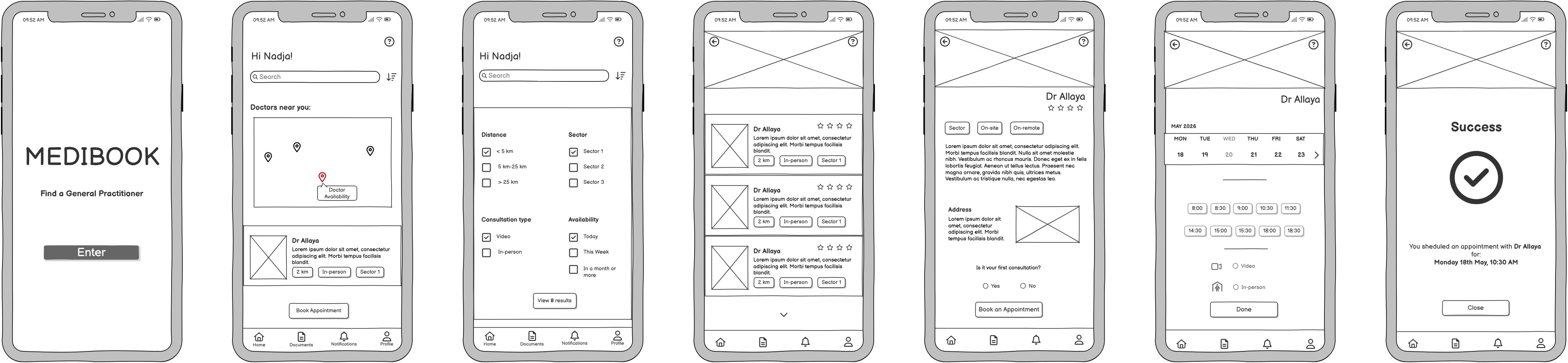
Minimalist onboarding The landing screen contains only the app name, a clear goal statement (« Find a General Practitioner ») and a single prominent CTA. Users arriving at this screen may be anxious or in a rush, cognitive load must be minimised from the first interaction.
Map + search bar duality on the homescreen Two entry points coexist: a search bar for returning patients who know their doctor’s name, and a map for users who need the nearest available practitioner quickly. This balances precise search with exploration without forcing a choice upfront.
Modal for filters over dropdown menus Four filter categories (distance, sector, consultation type, availability) could have been displayed as dropdowns under the search bar. The modal was chosen instead to reduce visual clutter, decrease the number of simultaneous choices visible at once and invite the user to focus on one task at a time. According to Hick’s Law, each filter is limited to three options maximum to reduce time-on-task.
Checkboxes were used over radio buttons for multi-select filters: users can select both « Video » and « In-person » if they are open to either. The CTA button updates in real time to show the number of results, letting users adjust their search without committing.
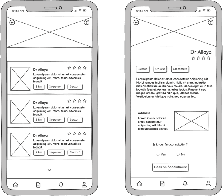
Calendar carousel over full calendar A scrollable weekly carousel shows available slots directly, without displaying an entire monthly view. A full calendar would clutter the layout and create accessibility issues for screen reader users or keyboard-only navigation. The carousel supports swipe gestures and is easier to parse when tired or in a hurry. Chips display only available time slots, further reducing perceived choice and time-on-task.
Progressive disclosure on the booking screen The booking screen is divided into sequential steps (day → time → consultation type). Lower sections are greyed out until the previous step is completed. This guides attention progressively, reduces cognitive overload, and makes the number of remaining steps transparent.
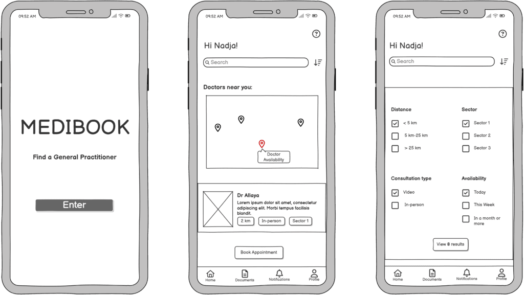
Radio buttons for yes/no and single-choice questions Radio buttons were chosen over toggles for binary decisions such as « Is it your first consultation? » — a toggle is intuitive for on/off states but introduces ambiguity for yes/no questions and requires additional mental effort.
Consistency through recognition and recall Chips, four-star ratings and the doctor’s picture appear consistently across the results screen and the doctor profile page. Repeating visual patterns reduces decision-making effort and builds familiarity across the flow.
Success screen The confirmation screen uses a universally recognised checkmark icon (Jakob’s Law), a brief appointment summary and a single CTA to return to the homepage. The tone shifts to reassurance: the task is completed, the user can note the details and move on calmly.
Opportunities for further development
With more time, the next steps would be usability testing with real users across age groups, particularly non tech-savvy patients.
High-fidelity prototyping and an accessibility audit would follow before any handoff.
Tool: Balsamiq (wireframing)