Product Design (UI/UX)
Hostel Booking App
Tourism, Service
Design System, Interaction Design, Prototyping, User Flows
December 25-January 26
Overview
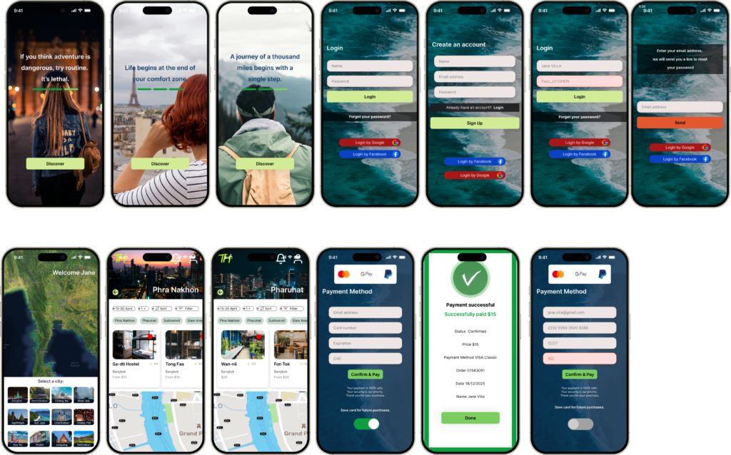
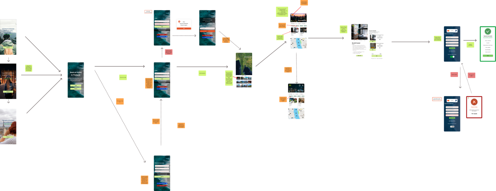
I designed a responsive prototype for a Hostel booking app prepared for handoff, including workflow conventions, accessibility considerations and descriptions of interactions and behaviours. The different steps of the experience are represented, from the three-step onboarding process to the payment page, including the happy path, alternative paths and error states.
As part of a university assignment, this project focused on designing a responsive UI and efficient user flows for a hostel booking app.
Goal
During my trip in 2024, I used the Hostelworld app, which inspired me to imagine an alternative product dedicated to a specific country: Thailand. This concept would allow the future integration of useful travel features such as visa information, weather forecasts, luggage storage locations, simple expressions to communicate easily and cultural rules travelers should not break.
The target audience is travelers aged 20 to 45 who enjoy independent travel.
Approach
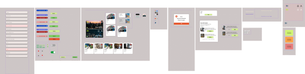
I first mapped the main user journey and alternative paths before designing the interface and defining the key interactions.
I created a moodboard.
I selected an appropriate color palette and typography.
I designed the prototypes.
Solutions & Outcomes
- Feeling of Belonging
The first step was to display inspirational quotes, because many young travelers use this type of app. The messages acknowledge that traveling can be intimidating and gently support users as they begin their journey, helping build their confidence. Then users can sign up or log in with Facebook or Google. The process needs to be as quick as possible.
My idea was to design an app dedicated to hostels where users can easily book a place near them using a map organized by neighborhood or area. Hostels are also places where people meet and socialize, which can be an important expectation for many travelers. Reading reviews about the atmosphere and services helps reassure backpackers and ensures they arrive somewhere safe.
Users can also save their favorite hostels and find them later in their profile. This feature allows them to keep track of places they enjoyed or revisit hostels where they had positive experiences and made connections.
- Quick Booking
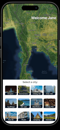
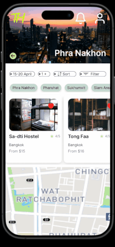
- After login, users can select a city directly from the map or explore hostels through the cards.
- They can either choose a precise area using chips or the map at the very bottom of the page.
- Users then select the hostel that suits them best. The interface displays the right amount of information to prevent cognitive overload and allow users to quickly scan the different hostel options.
- Users can book a room and complete the payment process, which can either be confirmed or rejected.
- The TH logo allows users to return to the homepage at any time during the process.
Users may also experience unstable internet connections while traveling, which reinforces the need for a simple and efficient booking process. Sometimes they plan ahead, while at other times they urgently need to find a place to sleep.
- Accessibility & Readability
I used a limited number of typefaces and strong contrast to ensure readability, facilitate quick scanning when users are tired or in a hurry, and improve accessibility.
Users can activate notifications to receive reminders for check-in and check-out times. When traveling, people can easily lose track of time due to jet lag, fatigue, or busy schedules. Notifications can also inform users about available rooms or events happening nearby or in the hostels where they are staying.
Travelers may also be tired or need to quickly book a room for safety reasons, so the entire process has to remain extremely intuitive. Although Thailand is not considered an unsafe country, reassurance remains important. In 2025, Thailand ranked as the 8th safest country for solo female travelers.
What I would improve
If I had to rethink this prototype:
I would redesign the login/sign-up and payment pages so that they integrate better with the overall visual design. However, I would keep their simplicity, which allows quick access to the homepage.
I would also reconsider the double carousel used for neighborhoods and hostels, as it might not be the most practical solution. Neighborhoods could be displayed differently, and it might be preferable to replace them with a search bar where users can type the name of a street or an area. This would give priority to the map.
In fact, focusing on the map may be more practical than relying on place names, as travelers do not always know where they are located. Since the Thai alphabet is different, it may also be easier for users to rely on their GPS, if it remains effective in airplane mode.
Finally, if this prototype were to be developed further, I would integrate the additional features mentioned earlier, such as travel information and practical tools for travelers.
Tools: Figma