Urban Outfitters
Interaction Design & UX Strategy
Retail
UX Audit · Interaction Design · Customer Journey · Competitive Analysis · UX Strategy
May 2026
Overview
In e-commerce, cart abandonment is one of the most costly UX failures. According to the Baymard Institute, the average abandonment rate across e-commerce is approximately 70% — rising to 85% on mobile. Among 18–29 year-olds specifically, the top reasons are unexpected extra costs (60%), a complicated checkout process (37%), and being forced to create an account before completing a purchase.
Urban Outfitters targets young adults between 18 and 28 — culturally sophisticated, self-expressive, trend-driven. Their website registered 22.2 million visits in March 2026, with a conversion rate of 1.0–1.5%, well below the e-commerce benchmark of 2–5%.
The research question: which interaction design decisions are creating friction throughout the purchase journey — and what recommendations would bring UO closer to its conversion potential?
Approach
I mapped the complete purchase flow from homepage to checkout confirmation, then structured the analysis in three parts:
1. Interaction Model Evaluation I identified five key interaction patterns — filtering components, product cards, dropdown menus, form inputs and search — and documented both their strengths and friction points. I also traced the main user paths on a Miro flowchart to visualise how users move through the site and where they drop off.
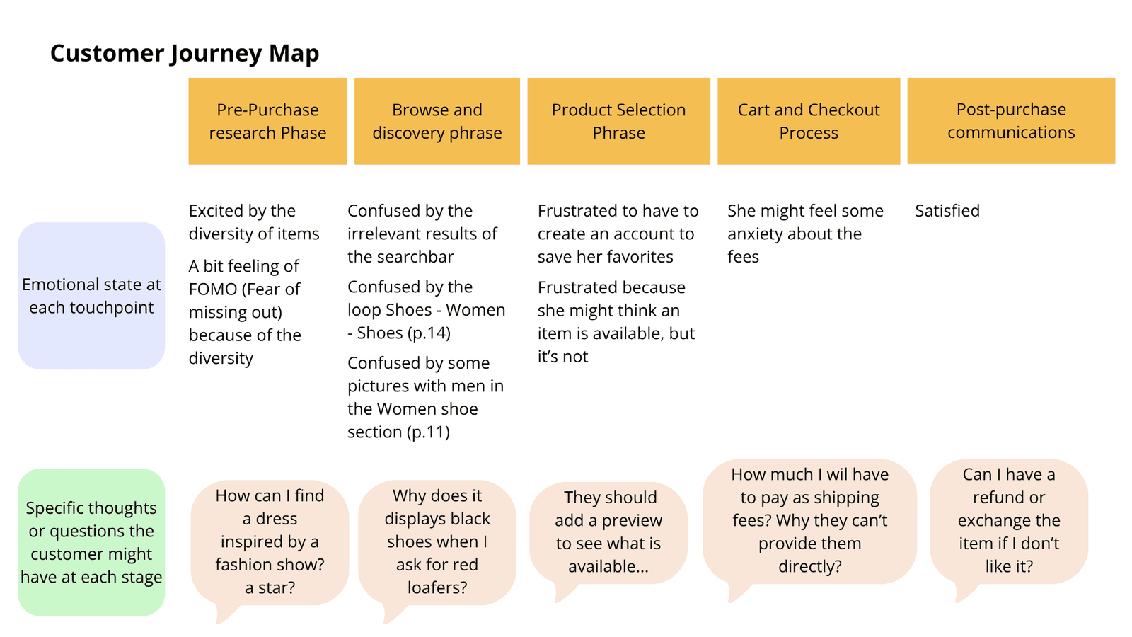
2. Customer Mapping I built a customer profile — Brittany, 18, a trend-driven student who uses her parents’ card and has zero tolerance for friction — and mapped her complete journey across five stages: pre-purchase research, browsing and discovery, product selection, cart and checkout, and post-purchase communications. The journey map documents her emotional state and specific questions at each touchpoint.
3. UX Strategy Development I analysed the business context (revenue data, audience demographics, communication strategy toward Gen Z), benchmarked UO against ASOS on six interaction dimensions, and developed prioritised strategic recommendations aligned with both user needs and business objectives.
Key Findings
Search & Navigation
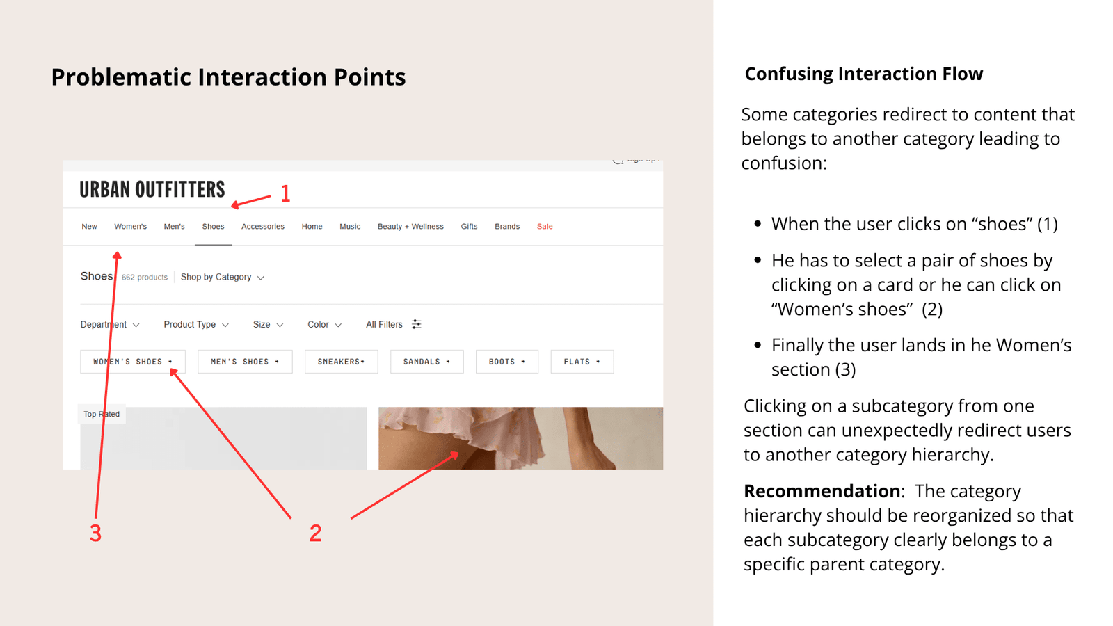
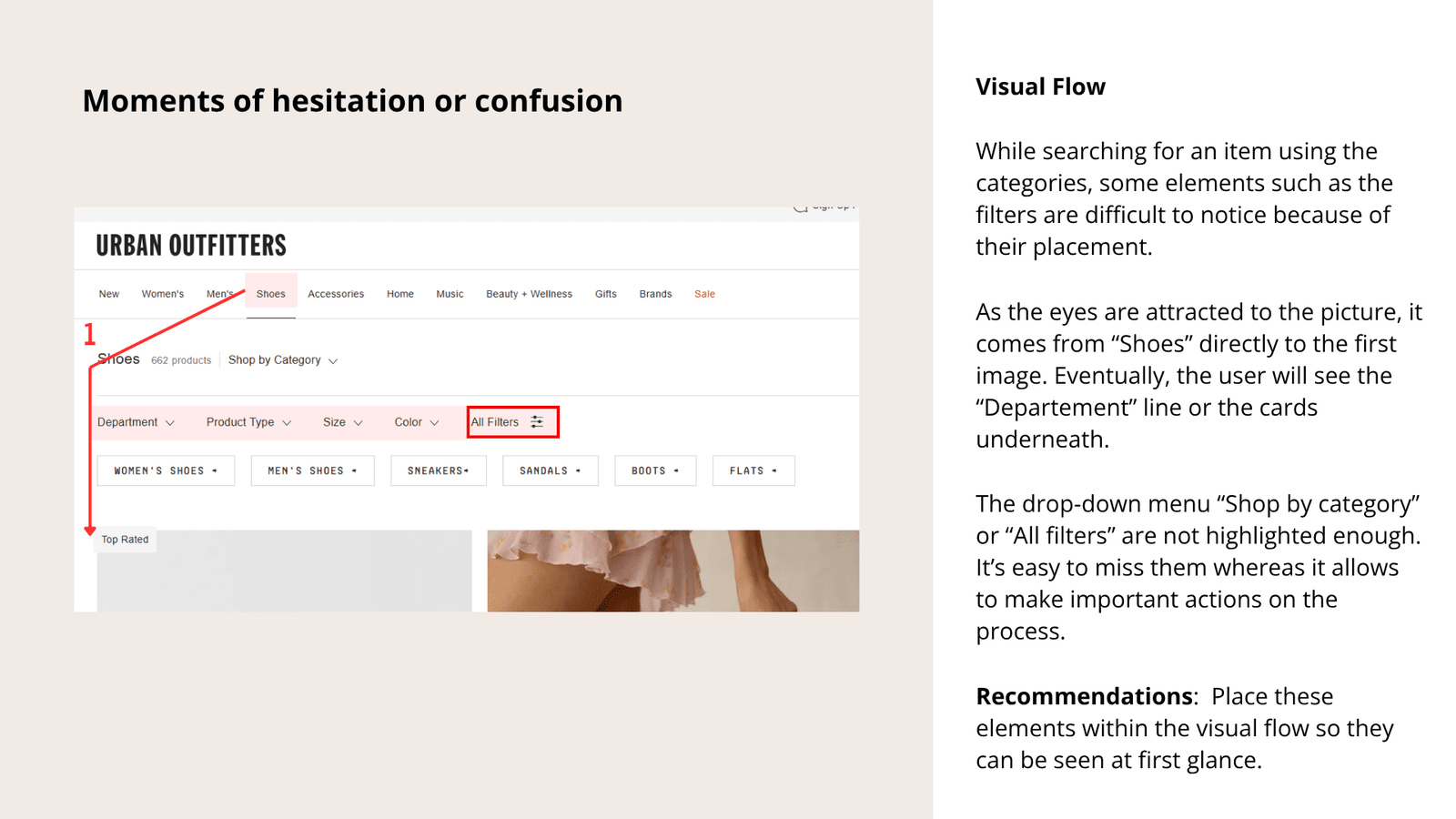
Users searching by category can get caught in confusing loops — clicking « Shoes » leads to a page where clicking « Women’s Shoes » unexpectedly redirects to the Women’s section, breaking the expected navigation hierarchy. The « All Filters » and « Shop by Category » controls are difficult to notice because of their placement outside the natural visual flow.
The search bar also returns inconsistent results: searching « pink loafers » surfaces non-pink results; searching « polka dress » returns a leopard dress. There is no fuzzy matching for misspellings.
Product Selection
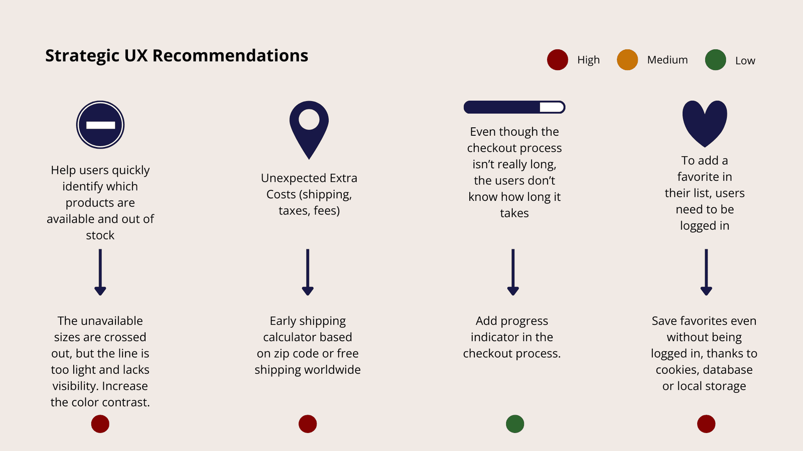
Unavailable sizes are crossed out, but the strikethrough contrast is too light to perceive at a glance. When browsing women’s shoes, some product cards show images of men wearing the items. The size chart requires horizontal scrolling, making it difficult to compare sizes across regions simultaneously.
The favourites list requires users to be logged in — a significant friction point for a target audience that values speed and is highly likely to abandon if forced to create an account mid-browse.
Checkout & Pressure Tactics
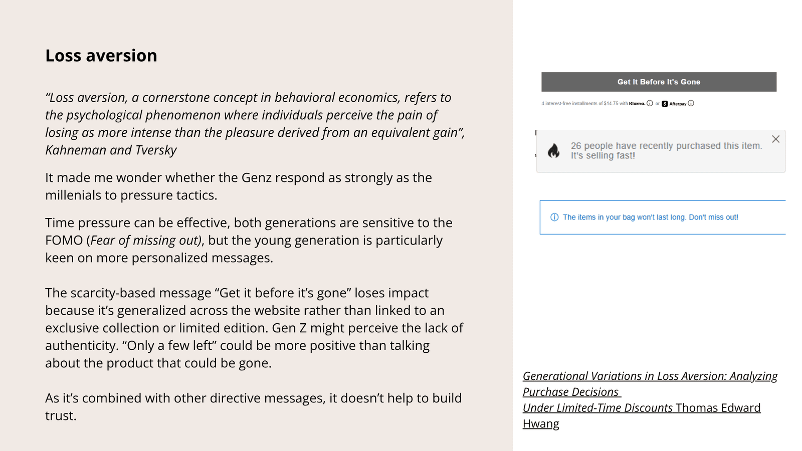
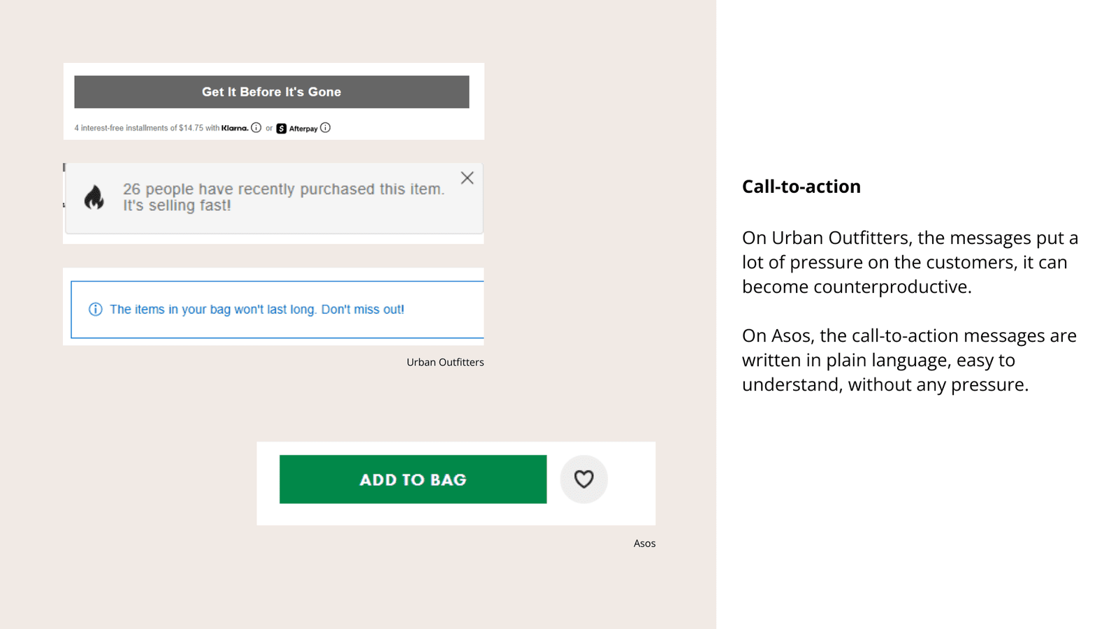
Pricing transparency is the highest-severity issue: shipping costs are not shown until checkout, creating anxiety and surprise at the worst possible moment. The call-to-action « Get It Before It’s Gone » is applied uniformly across the entire catalogue rather than being reserved for genuinely limited stock — a pattern that Gen Z, particularly sensitive to authenticity, may read as manipulative.
This is supported by research on generational variations in loss aversion (Thomas Edward Hwang): while both Millennials and Gen Z respond to scarcity, Gen Z reacts more negatively to generalised pressure tactics and more positively to personalised, honest messaging. Interestingly, Urban Outfitters does get one thing right: a session timeout message that reads « Don’t worry, your items will be preserved » — a human, reassuring tone that contrasts sharply with the rest of the pressure-oriented copy.
What ASOS does differently
The UO vs ASOS comparison revealed six key differences: ASOS displays subcategories directly rather than in nested dropdowns; allows guest users to save favourites without logging in; uses « Add to Bag » instead of pressure-driven CTAs; shows a progress indicator throughout checkout; and provides a persistent bag summary with total price and shipping. Urban Outfitters does better on seamless colour-variant loading and guest checkout — two meaningful UX wins worth preserving.
Brand Communication vs. UX Reality
Urban Outfitters describes its target audience as « culturally sophisticated, self-expressive and actively engaged with their peer group. » Since 2024, the brand has pushed further toward Gen Z through influencer campaigns and social media. Yet the website experience contradicts these values in several places.
Comparing UO’s communication strategy with Cider — a direct competitor more aligned with Gen Z expectations — reveals a gap. Cider displays diverse body types, publishes customer reviews in multiple languages, lets employees speak publicly about their work, and uses gamification with a points-reward system. Urban Outfitters’ communication leans on cultural editorial content and an alternative aesthetic that creates a sense of exclusivity — effective for brand identity, but it doesn’t translate into the digital experience.
The result is a tension between the brand’s aspirational positioning and an interaction model that still resembles a Millennial-era e-commerce site: forced account creation, opaque pricing, uniform scarcity messaging. Closing that gap is not just a UX problem — it’s a strategic alignment issue between brand promise and product reality.
Recommendations
Problems are ranked by severity: High (directly impacts conversion), Medium (creates friction and erodes trust), Low (minor improvements).
High Priority
- Improve size availability visibility — increase the contrast of crossed-out unavailable sizes so users can identify them at a glance
- Display shipping costs earlier — add an early shipping calculator based on postcode, or offer free shipping as a standard
- Allow guest users to save favourites — via cookies or local storage, without requiring account creation
- Fix the category hierarchy — reorganise so that subcategories clearly belong to their parent section, eliminating confusing redirect loops
- Improve search relevance — add fuzzy matching for misspellings and improve result accuracy for colour and attribute queries
Medium Priority
- Reduce pressure-oriented messaging — replace « Get It Before It’s Gone » with « Only a Few Left » when stock is genuinely low; reserve scarcity language for truly limited items
- Replace loading spinners with skeleton screens — the spinner on category pages creates a perception of slowness even when load time is short
- Add a checkout progress indicator — users have no visibility on how many steps remain, which increases anxiety
- Ensure pictures match items — particularly in women’s shoe listings where male-worn images appear
Low Priority
- Replace the cart modification pop-up with a dropdown — the current flow requiring a pop-up to change size adds an unnecessary step
- Make the size guide expandable — allow full-screen view to eliminate horizontal scrolling
- Use gamification to build community — recommendations based on recent purchases and trends, even for guest users; loyalty mechanics targeted at Gen Z values
What I have learned
This project sharpened my ability to connect interaction-level observations to business outcomes — moving from « this filter is hard to find » to « this is one of several compounding factors keeping conversion at 1.5% instead of 2.5%. »
The most interesting analytical thread was the loss aversion section: realising that a tactic designed to drive urgency might actively backfire with a Gen Z audience that has grown up recognising dark patterns. It pushed me to think not just about usability, but about the relationship between a brand’s communication strategy and its UX decisions.
If I were to continue this project, I would validate the persona and friction points through real usability testing with Urban Outfitters’ actual target users — the persona Brittany was built on secondary research and observation, not direct interviews. I would also run an A/B test on the CTA wording (« Get It Before It’s Gone » vs « Only a Few Left ») to measure the actual impact on conversion rather than inferring it from behavioral research.
Tool: Miro (research and mapping) · Canva (visual assets)